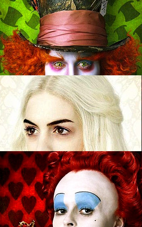
 I don’t think you can say Tim Burton is a bad director, but to call anything he does “visionary” any more is a big, fat overstatement. His stuff isn’t so much “visionary” as simply stamped “Tim Burton”– all the stripes and gaunt makeup and twisted architecture are variants on everything else he’s done to date and is expected. Of course, the whole conceit usually works, but I do have two nitpicks/requests: A) Give the hollow/red-tinged eyeball socket a rest and 2) enough of the Helena Bonham-Carter nepotism.
So what was all this leading to? Oh yeah– USA Today has some pretty incredible frst-looks of Burton’s upcoming Alice in Wonderland. While Alice most likely isn’t going to be any different than a Lewis Carol tale taking ultra-potent hits of Burton , some of the images are striking to say the least. To see the full character images as previewed at left (Johnny Depp as the Mad Hatter, Anne Hathaway as the White Queen and Helena Bonham-Carter’s forehead as the Red Queen), click here.
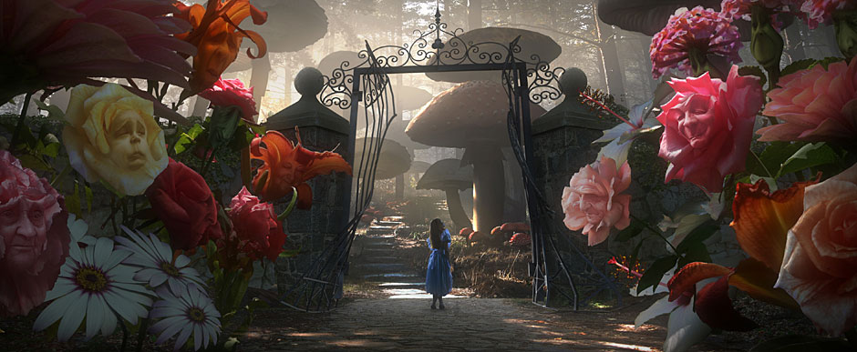
To see and explore some fantastical concept art, click here. Or just peek at (and click to make humongloid) the image below… which looks pretty great.


3 comments On Tim Burton’s Alice In Wonderland Looks Like Tim Burton’s Alice In Wonderland
I am so divided on Tim Burton. On one hand, I think just because you dress up your set with whimsical design, colors, etc, doesn’t make you a great director. On the other hand, I don’t think I’ve ever completely loathed anything he’s made. That’s probably a good sign.
He’s crap.
Pingback: Alice in Wonderland Teaser Trailer | ()
Comments are closed.